When we originally began this brief I
became really excited when I saw the themes we could choose from. My excitement
bloomed into exhilaration when I chose about the product as I am seriously
considering product analyst as a potential career path. As I delved into the
project I felt rather proud that it seemed I was one of the first in our class
to begin shooting my first images having a clear understanding of what I wanted
from my final website and images. Unfortunately as the project progressed I seemed
to have lost the original motivation as I gave my attention to other units. I
have found it difficult with the layout side of things and the more the technology
got involved the more my enthusiasm faded. Although I am happy with the content I am
displeased with the presentation of my work and I feel if we had more technical
assistance with this element of the project I could have exceeded my current
final outcome. Timing has always been an issue of mine and although I felt I began
early rather than following in my usual footsteps there still never seem to be enough
hours in the day to complete every task that I set myself, in an ideal world if
we had an extra week I would have loved to do some more shoots so there was
more varied images and to have played with layout more. To finish on a positive
note I was really proud of my more story style image inspired with candy and
think I made the right decision collaborating rather than attempting too many
jobs than I am capable of.
Thursday, 3 December 2015

About
When looking at themes to upload my website onto word press I was drawn towards one called pen scratch. I think was partially because it was very simple and clean and didn't have too many tabs in my opinion only home and about. It made me think a professional website usually does have another page you can click to where it gives you their mission statement you know what is the website actually for? This prompted me to write a small little summary of what i aim to achieve by creating this website and what it would include if it did continue on.
About
Making It Up is a website based on analysing products in as many ways as necessary. We explore the ingredients within the product, how effective the product is, why the product may be necessary in your daily/ weekly regime and finalise with looking at costs and or if you can create your own equivalent. Making it up is aimed at make-up lovers but we’re also looking to find out if the products provide the treatment promised. So for all those ladies looking for the hottest products we’ll be looking, all too closely, come have a sneak peak.
The writing
I have begun putting together all the ideas I want to include in the writing on my official blog it still needs polishing and a large part of it is the research I have already done on the product but I think this is what my blog is all about .. the product. so really it make sense, well I hope so.
Whats in it?
Whats in it?
Lush is known for their natural products, often featuring organic ingredients. When looking at the website I noticed it states 'we do not test our finished products on animals. We also only purchase from ingredient suppliers who do not test on animals.' These are all qualities that ultimately make a product more desirable.
Lush bubble gum scrub is a vibrant exfoliant for you lips. Application and use is simple with a great final out come
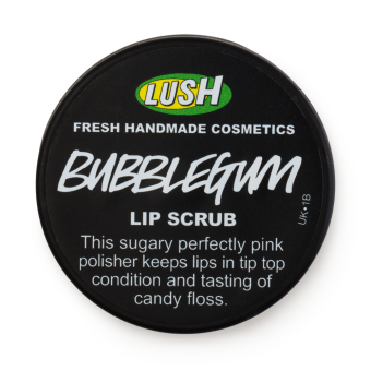
"Prep your lips with a buff and polish at the start of your make-up routine to ensure your lipstick glides on and stays put. Just apply with a clean finger, and let the exfoliating caster sugar and softening jojoba oil scrub away dead skin and infuse moisture to rejuvenate your smile." - lush
Sounds pretty fancy so far. So what makes up this pot of handmade, luminous pink, candy floss flavoured, organic lushness? excuse the awful pun. Turns out it's simply six ingredients. Caster sugar, Organic Jojoba oil, Alpha Isomethyl Ionone, Flavour, Colour 45410, Colour 45380. now the first two ingredients from this list are described as natural ingredients and the second half safe synthetics. but what are safe synthetics?
Safe synthetics are not as black and white as you think. yes a lot of cosmetics include toxins even lush's but as you may have noticed a lot of things in life include toxins. The difference is cosmetics don't have to put a warning sign on like you would have to with any aerosol can or you know most things. By noticing things like this you can be referred to as chemical phobic, unable to believe something is safe just because they say it is. On the contrary I think it is healthy to question what is written on the products we use, why not the average woman applies foundation everyday. Within the beauty industry words like natural and organic are thrown around a lot and we just believe it but in reality very few products actually are, this is just packaging. So if you can't prove if anything is really natural and organic then it just might be a good idea to find out which has less toxins/ chemicals. Or even which chemicals are safer to use. On the other hand you have 'product proud people' who know that REACH (the organisation who regulate cosmetics) have a standard of safety and that the quality of the product is more important than how many chemicals are in there. On this side of the argument it is also known that organic and natural products find it difficult to produce matt and high pigmented products which as a make-up artist will affect your purchases. However no matter if your chemical phobic or product proud all consumer product manufacturers do have to pass a certain guidelines that say they are safe.
After questioning and researching wether or not Lush's products are quite as organic and animal friendly as they say it turns out they really are putting in their best efforts but to create an effective product it can't be 100% organic as it simply won't do its job swell. I do think that as a product they have considered both the quality of the product and the quality of the ingredients and come to a fair middle ground. S
Get the Trend
Lets be honest we've all been talking about Kylie Jenner's lips for how long now? and although we all discuss the many cheats she may have used *cough*surgery*cough* we all desire those full lips. Well if like myself you haven't quite got the budget for the bizarre lip plumper's that are trending on Facebook, you could just start your daily routine with an extra few steps.- scrub your lips with a product such as lush's bubblegum lip scrub. It tends to bring more blood to the surface, so whilst it removes dry skin and smoothly buffs the surface they begin to look fuller.
- apply Carmex a few minutes after the removal of the lip scrub this keeps your lips moisturised in their plump state and keeps them fuller for longer.
- line your lips and apply your matt lip colour of choice
- top with gloss for the ultimate full lip.
costs/create your own
so to my next question, is 25g of this stuff worth £5.50, when you can get a bag of sugar and a jar of coconut oil for under £10 and make at least a kilogram of an equivalent product. This is of course is only one woman's opinion and making it this way will not leave your lips tasting of candy floss but instead coconuts. I am going to use this product to shoot with as the texture and vibrance of it is perfect for my idea.
taste test - the flavour - (second shoot)
don’t let your lips get frosty in the winter, istead give them that sugar frosting.
article Insperation

I found this Image on a blog by Elise Schalk and really loved the composition and she had written an explanation on why she had chosen these shapes and colours. This shows me that i need to try and consider these things as best i can when moving things around in my blog especially colour composition and not just the actual writing.
"A magazine layout using excerpts from the article "Women in Dance" by Wikipedia. For the article, I focused on creating the essence of dance through graphic elements and pictures such as the transparent blush shapes that mimic the dancers bodies and the layout of the body that strays from the typical two or three column grid. Following I translated the print editorial to a tablet format, highlighting different aspects of the article. " - Elise Schalk
I also found another mock layout by someone who isn't actually published that went by the online name of ADriana- xst

I don't really think I'm setting myself realistic expectations but its still good to look at inspiration so that if i find out it is achievable then i can strive for something I know I appreciate.
if i could i would
if I had enough time...
I have many more aspirations for this blog unfortunately by the time I realised this it was all a little too late. My second shoot is defiantly my favourite and I would have much rather created this into a fashion story about the taste of the product this would have intern changed my layout and so on. In my one to one with Sarah Abott my beauty is now teacher we discussed layout in much more detail as i mentioned this is my weakness within the unit but I am aware it will play a big role. My main fear is that I am struggling to make it look like a website on wordpress which is mainly blog format.
I have many more aspirations for this blog unfortunately by the time I realised this it was all a little too late. My second shoot is defiantly my favourite and I would have much rather created this into a fashion story about the taste of the product this would have intern changed my layout and so on. In my one to one with Sarah Abott my beauty is now teacher we discussed layout in much more detail as i mentioned this is my weakness within the unit but I am aware it will play a big role. My main fear is that I am struggling to make it look like a website on wordpress which is mainly blog format.
Wednesday, 2 December 2015
Second Shoot
For this shoot I felt there was more to prepare for and I can't lie I was a little nervous. carrying in a large bag of candy floss,strawberry laces, lolly pops and a large bag of sugar was humorous and well pretty heavy. As I did with my first shoot I chose to collaborate with Daniela Yordanova. She was my Photographer and editor and Lucy bowler played the role of my model for the day. To begin with I was really pleased with my Make-up there were elements I was nervous for but it went smoothly and it looked as I had imagined it. Really it was the finishing touches, styling, props and editing that made the image complete.


If I was to change anything further from this image if I had extended time I would edit the stray hairs out of the image. In retrospect I may have also been disinclined to add the tagline "with the taste of candy floss" as it makes the image more of an advert than an editorial although i still believe the intentions are clear. This would simply be to avoid being too obvious and avoid accidental marketing.
face chart
I've never been very good at face charts but for the second shoot it was rather necessary to start planning a little bit with colour themes and inspiration. As I said previously I wanted to base the shoot around candy floss and sweets like the sugary lip scrub.


The pink dots around the eyes are to signify the sprinkles I will apply and then the heavy pink around the face shows the highlight blush and eyeshadow. The props I plan to use are candy floss, lollypops, and strawberry laces. The eye shadow and lips will ale be bright pink.
Product Shot
When creating a website 'all about the product', well if I'm fitting to my brief, surely there should be a shot of some products i just didn't know whether or not to take shots of the products I've been talking about or to do shots of products that relate to the theme and colour pallet of the blog. My hesitation to use photos of the products I've been talking about is because I don't want it to seem as though I am advertising this. On second thought when including so much detail about a product it seems peculiar to then never show an image of it. I just need to be careful of my product placement and the way I phrase things.
I decided to aim to capture both and see what best fitted my layout. To start with I captured the Revolution Highlight Pallette as I think the colour tones fit well with the rather feminine blush tones of 'Making it up'.


I decided to aim to capture both and see what best fitted my layout. To start with I captured the Revolution Highlight Pallette as I think the colour tones fit well with the rather feminine blush tones of 'Making it up'.

I knew I wanted to capture the inside of the pallet because the outside of the packaging doesn't feature any colour other than gold. The reason I chose this product was for the pastel highlight colours with the pink offset. I used the green roses in the background so it wasn't just a white background that could have been boring or plain. For this same reason I chose to cover the surface with a polka dot blue shear shirt.

I think this shoot went well although again I'm not sure where to place it in the layout.
For the second shoot I chose to use the bubblegum lush lip scrub that I have based my other editorial images around. Instead of using lots of props for this image i chose to let the product speak for itself in vibrant colour. The background and surface is simply white for this shoot.

As I don't want it to appear as an advert i have spread the product out swell so it will be easier to edit into an appropriate section of my blog without it being distracting. In the end I have chosen to only use the bubblegum lip scrub as the other product isn't relevant and may be confusing if there itnt any information about it.

/the edited version/
Interpretive Shoot
I can admit my blog has quite commercial elements however I still want to incorporate editorial beauty more. I plan to do this with a shoot inspired by the product rather than directly including the product in the image. tho things came to mind, the texture, appearance and the taste. the texture being like crystals, the appearance being glittery and the taste being candy. From here I could see two approaches to creating this imagery embracing the appearance, with glitter or to emphasise the taste of the product embellishing the face with candy.
I started by wanting to use glitter. who can resist doing a editorial make-up inspired by bright pink glitter.
 |
| Charlotte Free in “Don’t Be Cruel” / Photographed by Donna Trope / For Purple Fashion Magazine Fall/Winter 2014/2015 |
 |
| source unknown. |
 |
| solvi strifeldt make up artist green glitter hair |
 |
| pintrest - found on star times.com |
 |
| photography paul ward. |


Wednesday, 18 November 2015
layout
Along side my images I will need to write 300 words minimum. I have chosen to use my main word count for a feature article so that the images can flow amongst the text. This will suit my images and themes much better than a trend or story image could


This is only the roughest sketch but has helped me visualise where things will go a bit more. I would like to have it all in one post under the blog so you can simply scroll down and read whats most recent, I know this isn't the most technical way of doing things. I would like my website to be like a beauty stream of products, whats in them, how to use them, similar products or how to recreate the product and an editorial image to end each post.
Tuesday, 17 November 2015
The first shoot
For My first shoot Daniella Yordanova was my photographer and Chloe Hall was my model. I have a strong belief that communication is key. In the build up to this shoot I had frequent online and in person conversations with both Daniella and Chloe about the design and the outcome I would like. I think this helped a lot so we didn't waist time when we were there.


I do really like My final Images although I wish I had been more confident with my application of the make-up. I wanted Chloe's natural complexion to be the beauty of the shot but in retrospect I think I could have had more coverage around the eyes and been more dramatic with the eyebrows. I also had an unexpected complication with the product itself. As the bubblegum lip scrub is designed to be a scrub and not to leave on the lips the sugar crystals do in fact melt. This was the antithesis of ideal as the shoot is based on the texture and colour of the product and I don't feel I've achieved this to the standard I wanted. In an ideal world I would re-shoot this so its perfect unfortunately I don't have time but if by some miracle we suddenly have 27 hours in a day it will be on the top of my list. Well that all sounded very dramatic and like I'm not happy which it not the case at all. Im really happy with her overall complexion and with the colour pallet of the shoot. It has a crisp, clean and bright finish to each image which is what I've been aiming for since I gathered my original inspiration from
"Janica Compte for The Fashion Hunters by Rachel Marques"

"Janica Compte for The Fashion Hunters by Rachel Marques"
Bubblegum Lip Scrub - Lush
As I have chosen 'about the product' as my theme for my website I think it is important to understand the brand and product before using it. Lush is known for their natural products, often featuring organic ingredients. When looking at the website I noticed it states 'we do not test our finished products on animals. We also only purchase from ingredient suppliers who do not test on animals.' These are all qualities that ultimately make a product more desirable.
Lush bubble gum scrub is a vibrant exfoliant for you lips. Application and use is simple with a great final out come
"Prep your lips with a buff and polish at the start of your make-up routine to ensure your lipstick glides on and stays put. Just apply with a clean finger, and let the exfoliating caster sugar and softening jojoba oil scrub away dead skin and infuse moisture to rejuvenate your smile." - lush
Sounds pretty fancy so far. So what makes up this pot of handmade, luminous pink, candy floss flavoured, organic lushness? excuse the awful pun. Turns out it's simply six ingredients. Caster sugar, Organic Jojoba oil, Alpha Isomethyl Ionone, Flavour, Colour 45410, Colour 45380. now the first two ingredients from this list are described as natural ingredients and the second half safe synthetics. but what are safe synthetics?
Safe synthetics are not as black and white as you think. yes a lot of cosmetics include toxins even lush's but as you may have noticed a lot of things in life include toxins. The difference is cosmetics don't have to put a warning sign on like you would have to with any aerosol can or you know most things. By noticing things like this you can be referred to as chemical phobic, unable to believe something is safe just because they say it is. On the contrary I think it is healthy to question what is written on the products we use, why not the average woman applies foundation everyday. Within the beauty industry words like natural and organic are thrown around a lot and we just believe it but in reality very few products actually are, this is just packaging. So if you can't prove if anything is really natural and organic then it just might be a good idea to find out which has less toxins/ chemicals. Or even which chemicals are safer to use. On the other hand you have 'product proud people' who know that REACH (the organisation who regulate cosmetics) have a standard of safety and that the quality of the product is more important than how many chemicals are in there. On this side of the argument it is also known that organic and natural products find it difficult to produce matt and high pigmented products which as a make-up artist will affect your purchases. However no matter if your chemical phobic or product proud all consumer product manufacturers do have to pass a certain guidelines that say they are safe.
After questioning and researching wether or not Lush's products are quite as organic and animal friendly as they say it turns out they really are putting in their best efforts but to create an effective product it can't be 100% organic as it simply won't do its job swell. I do think that as a product they have considered both the quality of the product and the quality of the ingredients and come to a fair middle ground. So to my next question, is 25g of this stuff worth £5.50, when you can get a bag of sugar and a jar of coconut oil for under £10 and make at least a kilogram of an equivalent product. This is of course is only one woman's opinion and making it this way will not leave your lips tasting of candy floss but instead coconuts. I am going to use this product to shoot with as the texture and vibrance of it is perfect for my idea.
Lip art
In Sarahs lesson we learnt about lip art this is a perfect example of how I can highlight an area of the face. I worked on Emma as my model it was really just playing around with techneques and practicing attention to detail. For the look below I bored her lips from a dark blue/ purple M.A.C lip liner and blend into a bright pink M.A.C lipstick then added gems to the bow of her upper lip and the centre of her bottom lip.


My response to lip art:
At the beginning of this lesson A light bulb turned on above my head. Why not use a product that helps create perfect lip art as lip art? Im talking about a lip scrub. One of my favourite items in my make-up kit that not many people use regularly. I find it peculiar that it isn't trending more especially as plump lips are so in fashion. I personally make my own lip scrub with sugar and coconut oil, but it will be interesting to use a product by a company and possibly compare the results from a home remedy. The other thing about a lip scrub is it has a beautiful crystallised texture that could make beautiful lip art if applied as a form of make-up.
Monday, 16 November 2015
Editorial Images - Inspiration
Janica Compte for The Fashion Hunters by Rachel Marques


Our first task for this project was to find editorial images that we liked and could inspire our work. When I found these images I looked no further, there is nothing I can fault. The colours, composition and precision is immaculate. This has given me more of an idea what I would like to do for my first shoot. I already knew that I would like to use a product that is used for a specific area of the face and have a basic make-up around it. This has made me think I would like to use something to highlight the shape of the lips or eyes. Looking at this editorial I am really trying to understand what is it that makes it stand out to me above other editorials I have looked at. I think that the model herself, Janica Compte, brings a lot to these images her dark skin tone means the make-up appears much brighter in contrast to her rich skin. Having the background as a flat bright primary colour is an unusual approach to editorial but it finishes the look. I need to consider my background colour when shooting as it won't necessarily co-inside or suit my images.
Monday, 9 November 2015
Project Brief: Beauty is now
'With the boom in online media, now more than ever, freelance make-up artists are contributing to online magazines or even developing their own online magazines and blogs in the effort to better promote themselves as a brand. Equally, make-up artists working for cosmetics brands are now expected to maintain the blogs for that brand and often the responsibility extends to the written word for all online media platforms.' - mycourse
'Beauty is now' is my optional unit this year and in our first lesson we were briefed on our project. As explained in the quote above it is of growing importance that as make-up artists we are able to present our ideas, designs and thoughts on social media. It may not have been before but this is now seen as vital element of being successful within our industry. To complete The brief we must create a website similarly to the way we will when we begin our careers. This website can be interpreted as a online portfolio, a large online article or more of a how to page. The Brief is largely up for interpretation. A big part of how we each individually interpret the brief will be based on which of the themes we choose from.
We have Five themes to choose from:
·
Skin
·
Organic beauty
·
Its all about the product
·
Structure and form
·
Beauty is boring
Reflecting on the Brief:
Reflecting on the Brief:
Initially when responding to a brief there is always a lot of ideas floating about, excitement and nerves all at once. I always want to start shooting immediately, however like anything in life you need to start with the basics. In this circumstance the basics being what theme am I going to choose and what am I going to name my blog.
I have chosen 'It's all about the product'. To start with I considered 'organic beauty' but I quickly realised that my interest in organic beauty is for organic products so I can explore this theme more specifically with 'about the product'. Once I had chosen my theme i found the name for my blog came quite naturally. The name of my blog is going to be called 'making it up' this is my fun little spin on words. The meaning of the words being that the blog will be talking about make-up and weather or not they make up the facts they use to sell the product.
Subscribe to:
Posts (Atom)